 I think Micheal's concept is creative. I do not think it will at all fit correctly onto our dragonfly. I think it will not be cohesive and would not at all be unified with our dragonfly. I like his idea very much but i do not think it would work for our dragonfly. But it is very pop art-ish and incorporates the curvy lines from art nouveau.
Wednesday, August 18, 2010
Micheal's Concept
I think Micheal's concept is creative. I do not think it will at all fit correctly onto our dragonfly. I think it will not be cohesive and would not at all be unified with our dragonfly. I like his idea very much but i do not think it would work for our dragonfly. But it is very pop art-ish and incorporates the curvy lines from art nouveau.
Mariama's Concept
 This concept is very pop art-ish mixed with art nouveau.It is very creative and I like it. But, I think this would clash with our designs we have on our dragonfly. Even if we used another color palette I think it would be too much to have on the dragonfly's legs and it would break up the unity and would become somewhat distracting. The desing is not at all cohesive with the rest of the dragonfly. To explain, it does not give off a nature feeling nor does it have the mosaic pattern.
Monica's Concept

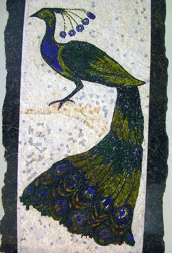
I like Monica's concept but instead of using the colors above we could use colors from the front of the wings, like the Bayberry Blue and we could add the Tangy Orange color to make the colors pop. The Tangy Orange tends to make the Bayberry Blue pop, so it would have our legs stand out but it would also be cohesive to wings. Also, towards the top of the design it has some sort of geometrical design similar to the peacock wings we have on the back of our dragonfly's wing. It wouldn't be too far off from our design we have now. So overall I like this concept a lot.
My Concept :)

For my concept I think we could use the sun on the dragonfly's legs but instead of red and blue water we could use the color palette from the back of the wings since they are quite similar. We could place the sun a little lower so half of the sun it on one leg and the on the half is on the other leg creating perfect symmetry. If we use the color palette from the back of the wing, especially the Southern Belle it would make our dragonfly 'united' and very cohesive .
Brainstorm #1

I think we could use the wings in the legs because it would create unity with the body. I also think if we use the swirls in the legs it would bring elements from our body onto the legs creating a harmonized piece. If we used colors from the wings on the legs it would balance out our piece by using elements from the body and the wings instead of just the body.


Roy Lichtenstien & Trees
I think this would look really nice on our dragonfly's legs since we already have birds, the sun would add a more natural and nature feeling. If we put Lichenstein's sun towards the top of the legs and trees going down the legs it would look really cool.
Warhol & Art Nouveau


I think if we use repetition of the swirls with the colors from the body and the wings on the legs it would look nice. It would bring elements from the wings and the body on the legs. Like Warhol used similar colors in his repetition of Marilyn Monroe's paintings. It brought elements from each square into the next.


Tuesday, August 17, 2010
Keith Haring & Art Nouveau


I would use vivacious colors similar to those Keith Haring used and incorporate them into the legs of the dragonfly. Haring made his work very animated and the people seem very flexible. So I would put colorful dragonflies on the legs and make the wings look as if they're moving. In art nouveau the lines are very 'curvy' so I would increase the curves to give the dragonfly more flexibility. This is like something I have in mind. But I would add bolder lines around the dragonfly to make it look like it moving. Similar to what Haring did.


Bob Dylan & Andy Warhol
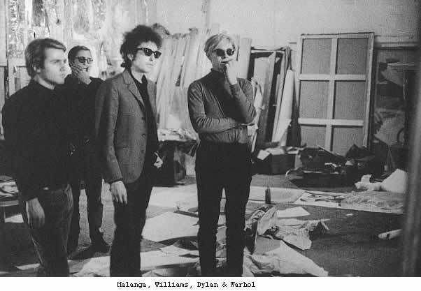
As we are learning about Pop Art, we've learned that Andy Warhol has played a major role in the Pop Art movement. He changed the way people looked art and made it contemporary and modern. He spent hours in his studio "The Silver Factory" making the simplest things into art masterpieces. Warhol was also obsessed with modern icons and celebrities. At the time Bob Dylan was one of the most praised singers and songwriters. He was at the peak of his career and Warhol was obviously interested in Dylan. In the documentary of Andy Warhol we saw that Dylan was present there, not only because Warhol might have been interested in Dylan but they were also quite similar. Warhol defied the norm with his modern contemporary works and like Warhol, Dylan defied the norm also. His music defied the typical pop music. His music contained political messages which everyone did not agree with but they did enjoy his music. Similar to how everyone didn't agree that Warhol's work was art but many did appreciate it and start to follow after him. It was later said Dylan and Warhol no longer had a friendship because of Dylan's dislike towards Warhol because of Edie Sedgwick.
Bob Dylan : Tangled Up in Blue
"Tangled Up In Blue"
Early one morning the sun was shining
I was laying in bed
Wond'ring if she'd changed it all
If her hair was still red
Her folks they said our lives together
Sure was gonna be rough
They never did like Mama's homemade dress
Papa's bankbook wasn't big enough
And I was standing on the side of the road
Rain falling on my shoes
Heading out for the East Coast
Lord knows I've paid some dues getting through
Tangled up in blue.
She was married when we first meet
Soon to be divorced
I helped her out of a jam I guess
But I used a little too much force
We drove that car as far as we could
Abandoned it out West
Split it up on a dark sad night
Both agreeing it was best
She turned around to look at me
As I was walking away
I heard her say over my shoulder
"We'll meet again someday on the avenue"
Tangled up in blue.
I had a job in the great north woods
Working as a cook for a spell
But I never did like it all that much
And one day the ax just fell
So I drifted down to New Orleans
Where I happened to be employed
Working for a while on a fishing boat
Right outside of Delacroix
But all the while I was alone
The past was close behind
I seen a lot of women
But she never escaped my mind and I just grew
Tangled up in blue.
She was working in a topless place
And I stopped in for a beer
I just kept looking at her side of her face
In the spotlight so clear
And later on as the crowd thinned out
I's just about to do the same
She was standing there in back of my chair
Said to me "Don't I know your name ?"
I muttered something underneath my breath
She studied the lines on my face
I must admit I felt a little uneasy
When she bent down to tie the laces of my shoe
Tangled up in blue.
She lit a burner on the stove and offered me a pipe
"I thought you'd never say hello" she said
"You look like the silent type"
Then she opened up a book of poems
And handed it to me
Written by an Italian poet
From the fifteenth century
And every one of them words rang true
And glowed like burning coal
Pouring off of every page
Like it was written in my soul from me to you
Tangled up in blue
I lived with them on Montague Street
In a basement down the stairs
There was music in the caf,s at night
And revolution in the air
Then he started into dealing with slaves
And something inside of him died
She had to sell everything she owned
And froze up inside
And when finally the bottom fell out
I became withdrawn
The only thing I knew how to do
Was to keep on keeping on like a bird that flew
Tangled up in blue.
So now I'm going back again
I got to get her somehow
All the people we used to know
They're an illusion to me now
Some are mathematicians
Some are carpenter's wives
Don't know how it all got started
I don't what they're doing with their lives
But me I'm still on the road
Heading for another joint
We always did feel the same
We just saw it from a different point of view
Tangled up in Blue.
I think Ariana had us listen to Bob Dylan because when he came out he music defied most pop music. Similar to how Andy Warhol's art defied the "norm". The two were similar and gravitated towards one another.
Thursday, August 12, 2010
Andy Warhol & Our Dragonfly

This would go well on our dragonfly because it has to do with nature and adds the elements of Pop Art.

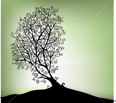
Geometric Tree Design for the Legs!

<---- this type of tree with these colors would compliment the colors of the body very well.

 I think this would be a good tree design to use on our dragonfly's legs. The balance of the tree is a not exactly centered but that would work well because our birds on the body are not perfectly aligned but look as though they are flying. I think the design is simple and easy to mimic. It also has an art nouveau kind of design which we were originally going for. The flowers on the tree also add to the nature feeling our dragonfly represents.


Tuesday, August 10, 2010
Making Progress :)


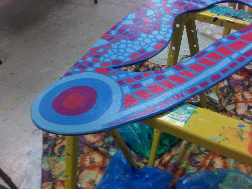
 I really like the way our dragonfly is turning out. We have mad a lot of progress with our dragonfly since we first began. The colors that we've chosen compliment each other well and the patterns we used on the wings look great. The body of the dragonfly looks good with the birds on them. Also, the blue outline on the wings make the colors POP! It has been alot of work but it is coming along great.
Thursday, August 5, 2010


Subscribe to:
Posts (Atom)